Introduction
This week, the draft CAD design was finished! Isaac began working on the polished rendered version of the CAD, the layout of the main content in the website was planned, the colour scheme and typography of our website was chosen, and work was done to update and refine previous progress logs.
CAD Designs
Ship
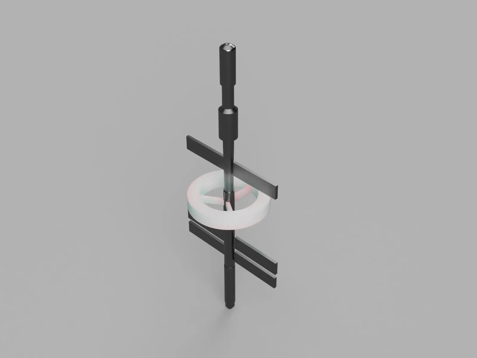
This week, Will finished his draft CAD design in Fusion 360. Isaac imported it into Blender, and began working on polishing, such as fixing the scale. Blender was found to be a better tool for this polishing methodology, due to its ability to edit every vertex and edge, as well as allowing for quick changes to the rendering as well. Figure 1 shows the draft CAD design.

Base
However, due to the impending approach of the deadline, longer than expected times for website development and CAD design, as well as Isaac's absence last week, we have decided to not make a CAD design for the Base, as opposed to our initial decision in Week 12. We updated our Gantt Chart to reflect this.
Website Design Progress
Main Content Layout
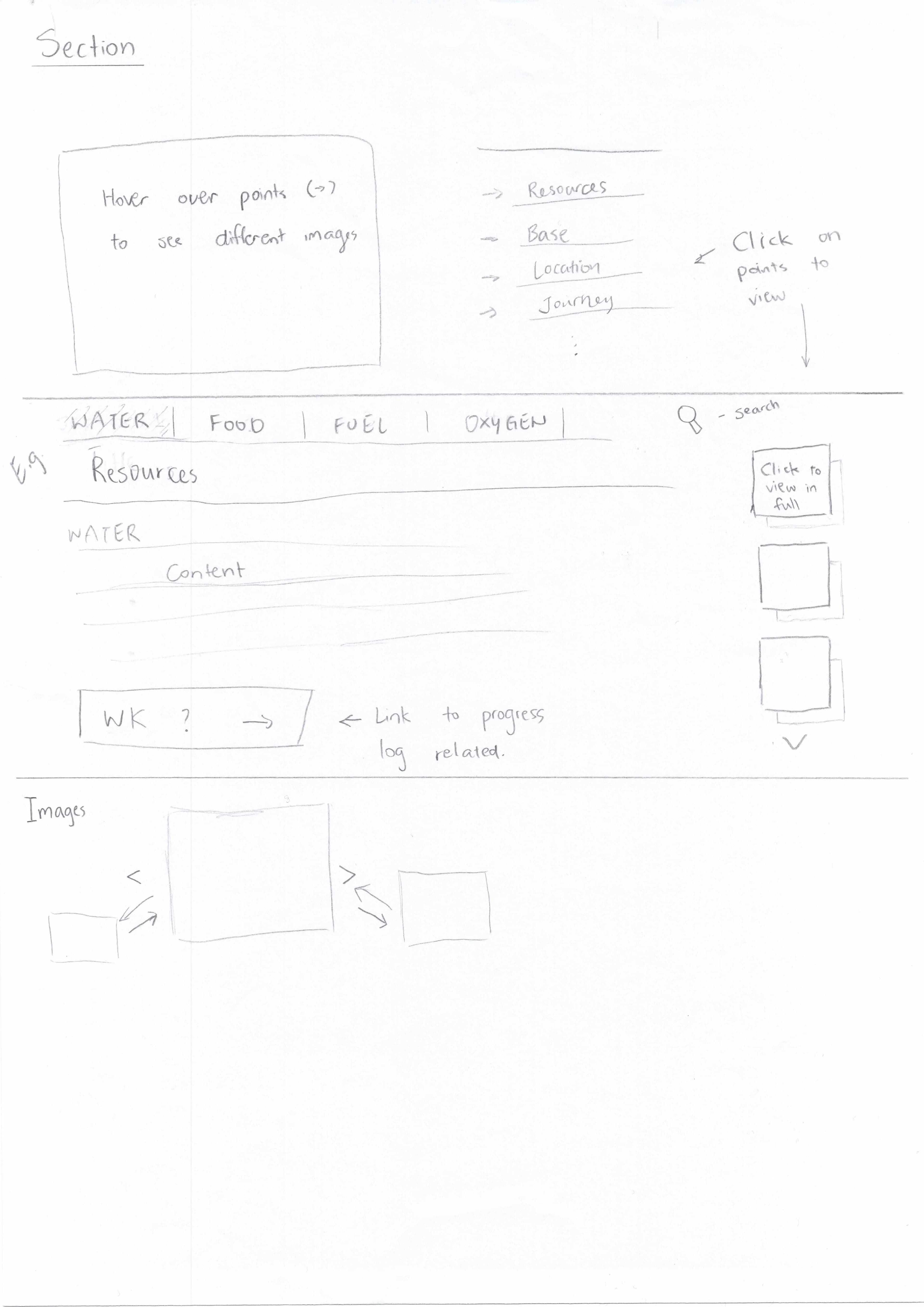
This week, Will & Christy, with ideas and feedback from Isaac, planned out the layout of the Main Content page of our website. This is shown in Figure 2.

Colour Scheme & Typography
Chosen Colour Scheme & Typography
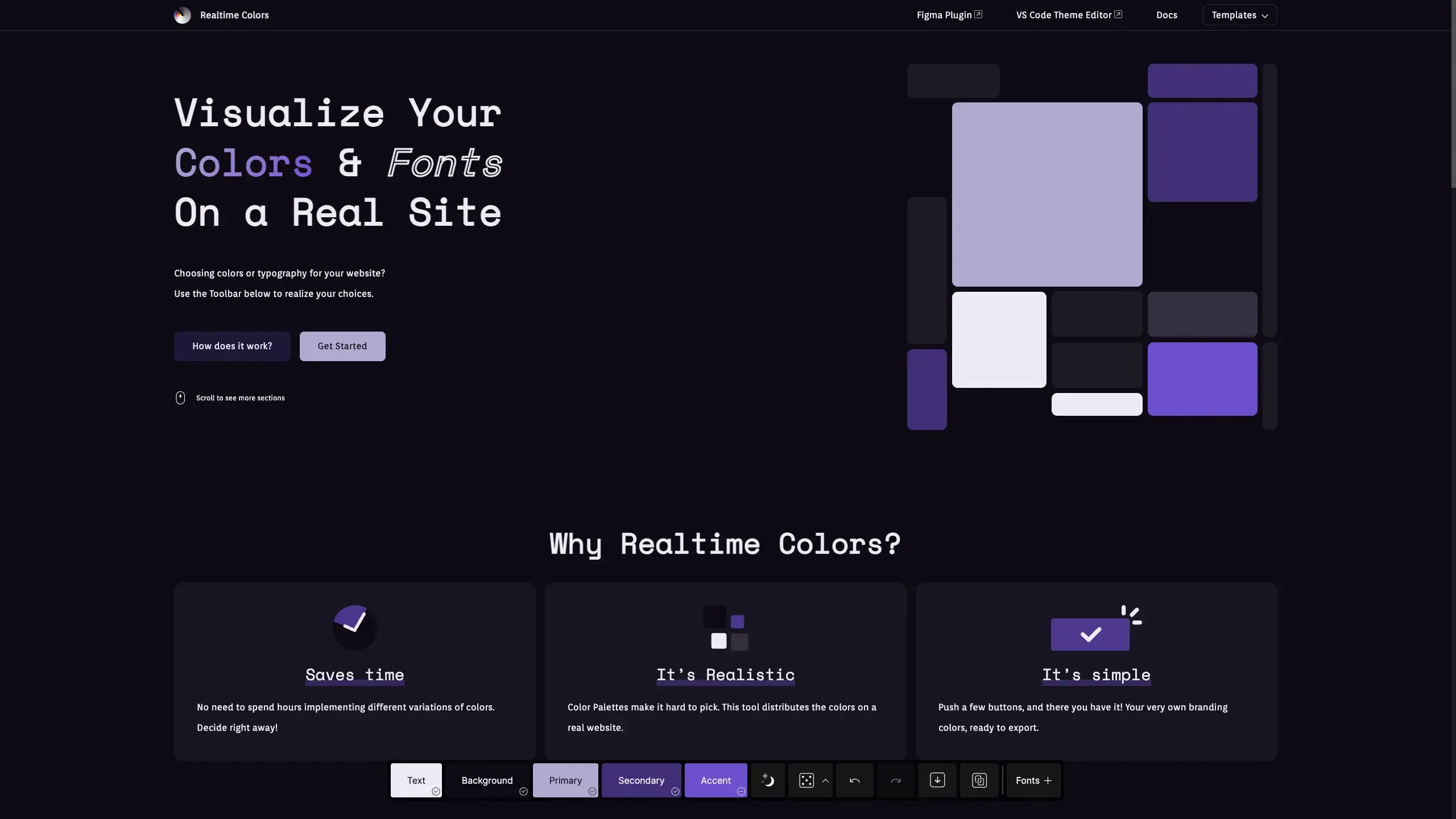
This week, we also chose a colour scheme and typography for our website, to be applied by next week. The chosen colour scheme can be visited here, and is also shown in Figure 3.

Why?
The colour scheme was narrowed down to a purple colour, due to its royalty and richness look. There were two purple colour schemes, and the one with a brighter primary colour was chosen, as way to make the website be more welcoming and open.
The main font, Orienta, was chosen as it looked professional, and the header font, Space Mono, was added as a contrasting header font. Due to the contrast in type (Orienta is sans-serif, Space Mono is monospaced), this was very effective. (Also, Space Mono… is spacey!)
These decisions were greatly assisted by our supervisor at the time, Ms. Kwan Ling Ho.
Alternatives
Alternative colour scheme and typography options which were presented can be seen in the footnotes.
Footnotes
Alternative Colour Scheme Options
- Simple
- Gemini Inspired
- Gemini Inspired, Higher Secondary Contrast
- Pinkish
- Chosen Option: Purply
- Purply v2
Alternative Typography Options
Note: these showcases include the font as the main font for both the header and the main paragraph text.